

table of content
- Common UI/UX Challenges and AI-Driven Ways to Address Them
- UI Mistakes vs UX Mistakes: How to Tell Which One You Have
- Where the Evidence Comes From (and What AI Can and Cannot Do With It)
- Mistakes in the First Minute
- Layout and Navigation Mistakes
- Interaction Mistakes
- Speed, Trust and Inclusion Mistakes
- What to Fix First
- A Quick Example: One Review Pass, One Fix
- Conclusion
- FAQs


Mobile App UI/UX Mistakes to Avoid: How AI Helps You Catch Them Early
Common UI/UX Challenges and AI-Driven Ways to Address Them
Most apps don’t lose users because of one big failure. Users get annoyed by a lot of little things and stop using the app. These include sign-ups that appear too early, buttons that are hard to hit with a thumb, and error messages that say nothing useful.
Each of these looks minor on its own. Together, however, they decide whether the user comes back to the app the next day.
Finding these small issues is difficult. Users leave one-line reviews or simply uninstall the app. Support tickets pile up, and nobody has time to watch hours of screen recordings of people using the app. If you are planning an app with a mobile app development company, or fixing one that is already live, you probably have most of this data already. What you usually lack is the time to review it.
This is where AI helps. It can read tickets and reviews and group similar complaints together. It can also go through large numbers of session recordings and point out where the problems are. It does not replace testing with real people, but it tells you where to look first.
This article explains 13 of the most common mobile app UI/UX mistakes and shows how to spot each one using AI.
Quick Summary
- UI mistakes are about how a screen looks and feels: size, spacing, consistency. UX mistakes are about how the journey works: steps, order, effort.
- The 13 mistakes below cover the first minute, layout and navigation, interaction, and speed, trust and inclusion.
- AI is good at reading large sets of data (tickets, reviews and session notes) and surfacing patterns and clues. It is weaker at judging context and feelings, and it can miss accessibility issues. It adds value, but it needs human supervision.
- Focus on the main task first (sign-up, checkout), then remove other frustrations, then handle the polish.
- Always validate with real devices and real users. AI is a starting point, not the answer.
UI Mistakes vs UX Mistakes: How to Tell Which One You Have
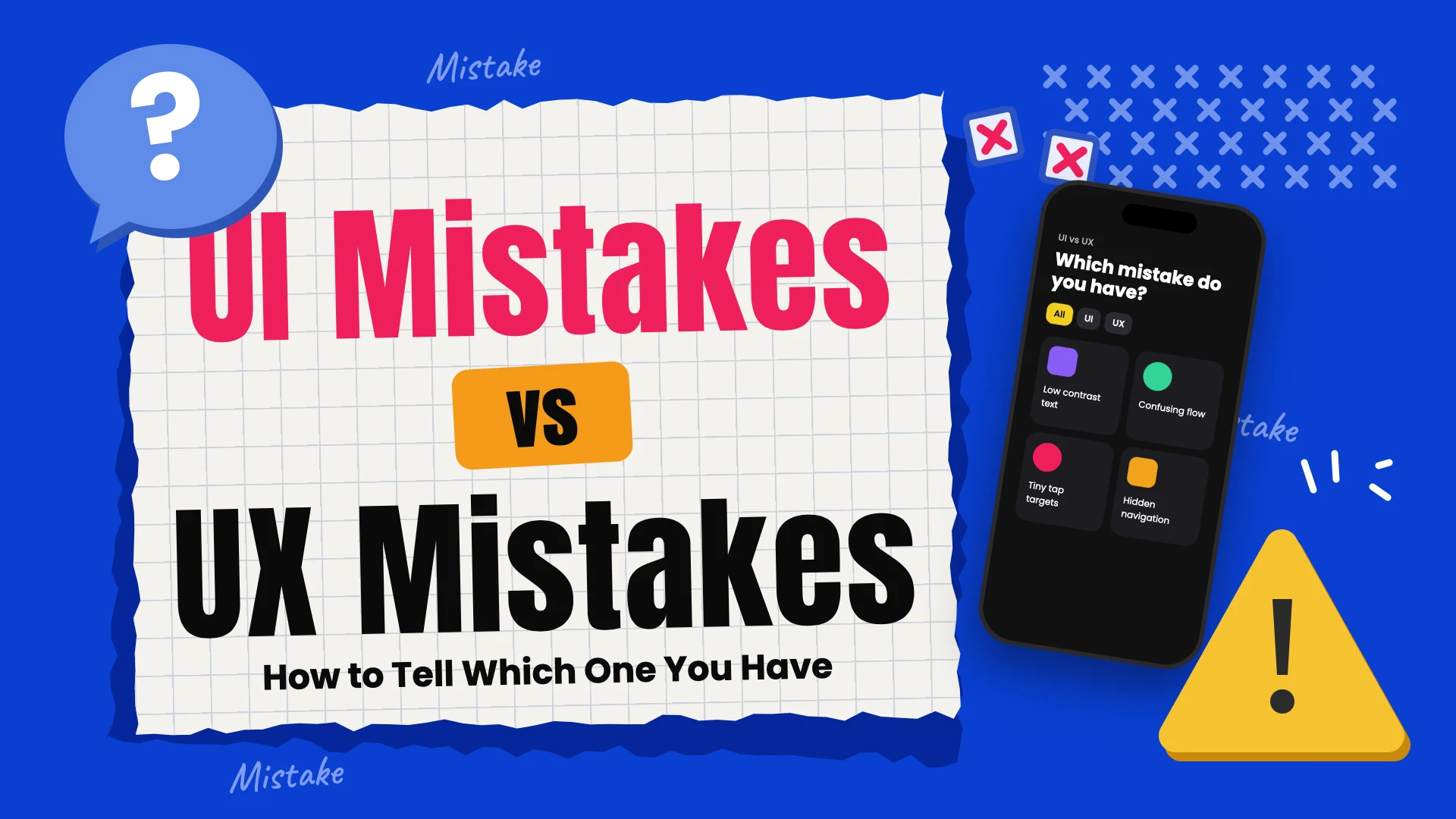
A good way to tell the two apart is to listen to how users complain. When they say an app is messy or hard to read, that is usually a UI problem. When they say they could not complete an action or did not know what to do next, that is usually a UX problem. The difference matters because the fixes are different. A UI problem can often be solved on one screen, while a UX problem may run across several steps.
| What users say or do | What it usually points to |
| “I can’t read this” or taps the wrong button | UI: text size, contrast, touch target size |
| “I couldn’t find it” or drops off halfway through a flow | UX: navigation, flow order, too many steps |
| “It looks different from other apps I use” | UI: inconsistent elements or ignored platform habits |
| “I don’t know what just happened” | UX: missing feedback or an unclear error message |
Sorting hundreds of reviews into these two buckets by hand takes days. AI can do a first pass in minutes. Paste in a batch of reviews, ask it to label each one as a UI complaint, a UX complaint or neither, and count the results. Treat the labels as a rough sort, because AI can misread sarcasm and very short reviews. Spot-check a sample before you trust the totals.
For the bigger picture on why both matter, see this guide on why UI/UX matters in mobile app development.
Where the Evidence Comes From (and What AI Can and Cannot Do With It)
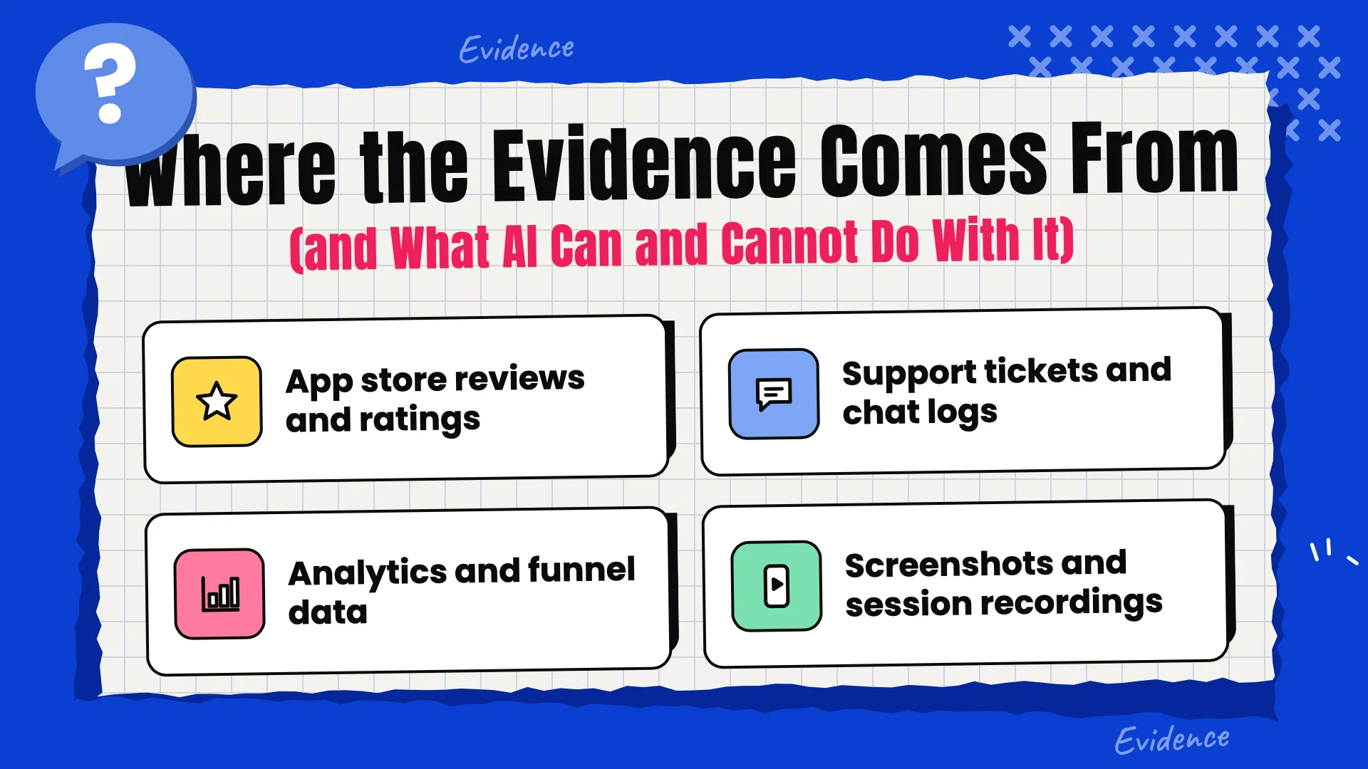
AI cannot identify UX issues on its own. It needs evidence to analyze. Before you go through the mistakes below, gather the following:
- App store reviews and ratings. These provide direct feedback from users, including complaints about their experiences.
- Support tickets and chat logs. These show where users get stuck and have to ask for help.
- Analytics and funnel data. Where users drop off during sign-up, search, cart and payment.
- Screenshots and session recordings. The screens themselves, and what people actually did on them.
With these in hand, AI can group repeated complaints so you can see the biggest themes. It can summarize long chat or call sessions. It can also review a screenshot against a checklist, such as text size, button spacing or missing labels.
Of course, AI has limits. It does not know your business rules or how a screen feels in the hand, and it can be confidently wrong. Use it to decide where to look, then confirm with real people and real devices. Also be careful with user data. The best practice is to remove names, emails and other personal details before you paste anything into an AI tool.
Mistakes in the First Minute
The first minute is when a user decides whether to keep using your app. The following mistakes show up again and again.
Mistake 1: Asking for Sign-Up Before Showing Any Value
What it looks like: The app opens to a sign-up form. Email, phone number and password are all requested before the user has seen a single useful or appealing screen.
Why it hurts: The user has not yet decided that the app is worth the effort. Asking for personal details before they have seen anything useful often leads them to close the app straight away.
The fix: Let users browse and try one of your app’s core features first. Ask for an account only when it is necessary, for example when a user wants to save their progress or make a purchase. When possible, offer one-tap sign-in and keep the form as short as you can.
Reading the evidence: Look through your app reviews for phrases like “why do I need an account” or “too many steps to start”, and let AI group similar responses. Then look at your funnel data. Reviews and data together will help you decide which issues to address first. If drop-off spikes at the sign-up step, you have probably found your first issue.
Mistake 2: Long Onboarding Tours
What it looks like: A series of five or six swipe screens that tell users about your app’s features before they are allowed to interact with anything.
Why it hurts: Users have a specific task in mind. Many skip the tour, and those who do read it forget most of it by the time they need the feature.
The fix: Limit the tour to two or three screens and make it skippable. Teach features in context, with a short hint the first time a feature becomes relevant.
A faster way to test it: Run your onboarding screens through AI to flag jargon and make sure each screen carries one clear message. Then use AI to draft shorter versions that you can test against each other. On the data side, look at where users skip or exit the onboarding, screen by screen.
Mistake 3: Asking for Every Permission at Launch
What it looks like: Requests for notifications, location, camera, microphone and contacts, all before the user knows what the app does or why it needs them.
Why it hurts: A request with no context feels invasive, so users tend to tap Deny. iOS remembers the user’s decision, so after a denial, users generally have to change the permission later through Settings.
The fix: Ask at the moment the permission is needed, with a one-line reason. For example, ask for location when a user taps “Find stores near me”, not when the app opens.
What reviews will tell you: AI can rewrite your permission explanations in plain, friendly words. It can also scan reviews for privacy complaints such as “why does it need my contacts?” or “why does it need my microphone?”. Those reviews usually point to the exact request that feels out of place.
Layout and Navigation Mistakes
Once users get past the first minute, the next question is simple: can they find their way around? These four mistakes make that harder than it should be.
Mistake 4: Overloaded Screens
What it looks like: One screen carries banners, three buttons, a long paragraph and a pop-up, all asking for attention at once.
Why it hurts: When everything is loud, nothing stands out. Users cannot tell what the screen wants them to do, so they hesitate or leave.
The fix: Give each screen one main action. Move other actions into menus or later steps. Be honest about features that almost no one uses, because they still take up space on the screen and distract users.
A long feature list with no clear priority is a common root cause, which is why it helps to define mobile app features before design begins.
A simple check: Take a screenshot of the design and ask an AI tool to list every tappable element and name the main action on the screen. If the AI has trouble picking a main action, a first-time user probably will too.
Mistake 5: Hidden or Confusing Navigation
What it looks like: Features sit behind unlabeled icons or inside menus that almost no one opens. Users have to take four or five taps to reach a core feature.
Why it hurts: Users don’t go looking for features. If a feature is out of sight, they assume it does not exist.
The fix: Put the three to five main destinations in a bottom tab bar and add text labels next to the icons. If the app holds a lot of content, add search. Name things the way users think about them, not the way your development team does.
Knowing where users get lost: Reviews are full of clues here, such as “can’t find”, “where is” and “how do I”. AI can pull out every review with phrases like these and list which feature each one is about. The feature that appears most often is the one your navigation is hiding.
Mistake 6: Using the Same Design on iOS and Android
What it looks like: An Android app that behaves like an iPhone app, or an iOS app that behaves like an Android app, especially in navigation, gestures, dialogs and back actions.
Why it hurts: People develop habits based on the phone they use and expect every app to follow them. When an app doesn’t, it feels slightly wrong even if users can’t explain exactly why. For example, iOS users commonly expect an edge-swipe gesture to return to the previous screen, while Android supports system back navigation through buttons or gestures.
The fix: Follow each platform’s own patterns for back actions, gestures, dialogs, pickers and other system components, and keep your brand, colors and main flows consistent across both. If you are still deciding where to start, this comparison of iOS vs Android app development can help.
Comparing the two versions: Share screenshots of the same screen from both platforms with an AI tool, along with Apple’s and Google’s design guidance, and have it list differences that break platform habits. Confirm each point against the official guidelines before you change anything.
Mistake 7: Inconsistent UI Elements
What it looks like: The same action is a blue button on one screen, a green one on another and a text link on a third. One screen says “Save”, the next says “Submit”, and a third says “Done”.
Why it hurts: Users have to relearn each screen, and the app starts to look unfinished.
The fix: Use a small, shared set of buttons, colors, spacing and labels, and give each action a single name across the whole app.
Catching drift: As an app grows, differences creep in. You can share a batch of screenshots or your style values with AI to identify conflicting button styles, labels and spacing. It is a quick audit that is easy to repeat, for example before each release.
Interaction Mistakes
This group is about the moments where users tap, type and pay. Small frustrations here add up quickly.
Mistake 8: Small Touch Targets and Ignoring Thumb Reach
What it looks like: Important buttons placed in the top corner of a large phone, out of the thumb’s reach, and links and small controls packed close together.
Why it hurts: Missed taps are a small nuisance, but over time they become frustrating and make users lose faith in the app. Apple’s Human Interface Guidelines recommend a minimum control size of 44 by 44 points, and Google’s Material Design recommends 48 by 48 dp.
The fix: Keep frequently used actions within comfortable thumb reach, particularly on larger screens, and provide adequate spacing between controls. Make every tappable item at least the recommended size.
Checking sizes with numbers: AI cannot measure pixels reliably from a picture, so give it the numbers instead. Design tools and inspector tools can export element sizes. Then have AI flag any control smaller than 44 by 44 points on iOS or 48 by 48 dp on Android.
Mistake 9: Long Forms and Unhelpful Error Messages
What it looks like: A long form with many fields and, when something is entered incorrectly, a large red banner that says “Invalid input”. Sometimes the form also clears what the user just typed.
Why it hurts: Typing on a phone is slow, so a long form takes real effort. When something goes wrong, the user has to guess what they did wrong and what to correct.
The fix: Ask only for the information you need at that point. Show the right keyboard for each field, check entries as the user types, and keep what they have already entered. When something is wrong, write an error message that says what happened and what to do, such as “Enter a 5-digit ZIP code”.
Rewriting error messages: Pull every error message out of your app’s text file and run the list through AI, which can rewrite each one in plain words that explain the problem and the next step. This is a good job for AI because it is repetitive, and you can review every line before it ships.
Mistake 10: Friction at Checkout
What it looks like: Making a user create an account before they can buy anything, asking them to enter their shipping and billing address several times, and showing extra costs only on the last screen.
Why it hurts: The user has already decided to buy. If they lose interest or abandon the cart at checkout, the business loses a sale it had nearly won.
The fix: Offer guest checkout, save customer details for next time, show the full price early, support the payment methods customers prefer, and add a simple progress indicator. You can see how an online shopping app is structured in the eShop e-commerce app case study.
Finding the leak: With your checkout step names and the drop-off count at each step, AI can show which step loses the most people and what usually causes it. Then place a test order yourself, on a real phone, to see whether the explanation fits.
Speed, Trust and Inclusion Mistakes
This last group is more behind the scenes in a user interface, but users experience it every day they use the app.
Mistake 11: Slow Screens and No Feedback
What it looks like: The user taps a button and nothing happens for a few seconds. Screens stay blank while content loads in the background. An app can work great on the latest phone and feel sluggish on older, less powerful devices.
Why it hurts: When nothing happens after a tap, users understandably think the app is broken and tap again, which can make things worse. An app that is slow to respond also makes users question whether they can trust it.
The fix: Show a response the moment a user taps, load the essential parts of the screen first, use placeholder screens while content loads, and compress large images and files. For ideas on where speed gains usually come from, see this guide on how to improve mobile app performance with AI.
Ranking the slow spots: Export your slow-screen and crash reports and give them to AI, which can rank screens by how often they are slow and suggest likely causes. Treat the output as leads for your developers to check, not as a diagnosis. It lets them spend their time on real issues instead of digging through logs.
The other half of this mistake is testing only on the newest models or on simulators. Older hardware and weak connections show problems that a fast office connection hides. A mobile app testing checklist can help you cover them.
Planning your device list: An export of the phone models and OS versions your users actually have can go to AI, which can turn a large analytics sheet into a short list of devices to test on.
Mistake 12: Treating Accessibility as an Extra
What it looks like: Light gray text on a white background, icons with no text labels, text that stays tiny when the user increases the system font size, and screens that a screen reader cannot describe.
Why it hurts: Many people struggle with these choices, including people with low vision or limited hand movement, and anyone using a phone in bright sunlight. A widely used reference for accessible design is the W3C’s Web Content Accessibility Guidelines (WCAG). It was written for web content, but its guidance on things like contrast can inform mobile app interface design too. For example, level AA asks for a contrast ratio of at least 4.5:1 for normal text.
The fix: Use enough contrast, support larger text sizes, give every control a clear label for VoiceOver and TalkBack, and never use color alone to carry meaning. For example, don’t use red to show an invalid entry without also adding a text message.
A first-pass audit: Share your color values and a list of interface elements with AI to flag low-contrast pairs and controls without labels. Check the contrast results with a dedicated contrast checker, because AI can be wrong. Then test with a real screen reader and large text sizes. An AI check, or even a perfect score on a contrast checker, does not make an app accessible. People using assistive technology are the real test.
Mistake 13: Notification Overload
What it looks like: Several notifications a day, generic messages like “We miss you!” sent to everyone, and no control over the type or number of notifications received.
Why it hurts: Users end up muting notifications, turning them off or removing the app. Once notifications are off, you lose a useful way to bring people back for the moments that matter.
The fix: Let users choose which messages they receive and how often. Send messages that relate to something the user did or asked for, and keep the settings easy to find. Health and fitness apps, such as the FitWithUs diet and fitness tracking app, rely on reminders, so it is even more important that those reminders are helpful rather than pushy.
Reading the signals: AI can group reviews and uninstall feedback that mention notifications. It can also look back at last month’s message log and flag repeated or generic wording. Use that to rewrite your templates so each message refers to something the user actually did.
What to Fix First
After an audit you will probably have a long list. Realistically, you can’t fix everything at once, so prioritize what gets in the way of the user’s main task.
| Priority | What belongs here |
| Fix first | Anything that blocks the main task: forced sign-up, checkout friction, confusing errors, crashes, very slow screens, and accessibility issues that prevent users from interacting with important controls. |
| Fix next | Anything that slows or confuses: navigation, overloaded screens, small touch targets, long forms, notification overload |
| Fix when you can | Polish and consistency: mismatched UI elements, platform fine-tuning, wording tweaks |
AI is useful for this sorting step. Make a list of your findings, and next to each one add how many reviews or tickets mention it, which funnel step it affects, and a rough effort estimate from your developers. AI can then place each item in one of the three groups and explain why. The explanation matters, because it gives you something to challenge. Your team knows more about your specific situation than the AI does.
If the deeper issue is how the app was planned rather than how it was designed, these mobile app development mistakes are worth a look as well.
A Quick Example: One Review Pass, One Fix
This is a hypothetical scenario, not a real case study, but it shows how the pieces fit together. Imagine a small grocery delivery app whose ratings have slipped.
- The team exports a few hundred recent reviews, removes names and emails, and asks AI to sort each one into UI complaint, UX complaint or other.
- Most complaints point to a UX issue: users struggle to find an easy way to reorder items purchased the previous week.
- The team checks its analytics and sees that repeat customers go from the home screen to search, to the category, to the item they want, week after week.
- A small fix is adding an “Order Again” shortcut on the home screen that shows previous orders and lets the customer reorder with one tap.
- Before release, the team tests the change on real phones with a small group of customers, and afterwards watches whether reviews about reordering fade in the next update.
AI did the slow part, which was reading and grouping the reviews. People did the parts that need judgment: they checked the data, chose the fix and tested it with customers.
Conclusion
Most mobile app UI/UX mistakes don’t happen because people don’t care. They happen because the team has used the app too much to see what a first-time user sees. To the people who built the app, a sign-up wall, a hidden menu or a vague error message may seem obvious, even when first-time users struggle with them.
The same approach works every time: gather real data, fix what blocks the main goal first, and test every change on real devices. AI can help a great deal by reading and grouping large amounts of data. It cannot, however, replace the last step.
An easy way to get started is to take your latest reviews, remove the personal details, group them into UI and UX feedback, and see which group appears most. That single list will usually tell you where to begin. If you need expert help finding and fixing these issues in your app, feel free to contact CodeStore Technologies.